The right hue can transform a plain area into an immersive sanctuary that boosts the digital entertainment experience. Designers say that simple shifts in paint choices influence focus, calm, and energy during long sessions.
Color psychology shows how specific tones affect emotions and behavior. When someone plans a dedicated gaming room at home, they should weigh how shades interact with lighting and equipment.
Whether the goal is a high-energy arena or a quiet retreat, the palette will define the mood for years. Professionals suggest picking tones that reflect personality while supporting relaxation or intense focus as needed.
Understanding the impact of hues helps players feel more connected to their favorite games. A considered approach balances aesthetics and function so the setup remains the focal point of the space.
The Psychology of Color in Gaming
Different hues change perception, lighting, and mood in any entertainment space. The American Institute of Architects notes that color not only affects mood but also changes how light behaves and how large a room feels.
Understanding color psychology helps tailor an atmosphere that supports either sharp focus or calm relaxation. Designers say a deliberate color scheme forms the foundation of a successful interior and improves the overall gaming experience.
“Color choice significantly impacts perception of dimensions and lighting quality.”
When planning home design, consider how colors like deep blues calm the mind while vibrant reds raise energy during competitive play. A thoughtful color choice reduces stress and keeps players immersed in their favorite game for longer.
For more on psychological effects and practical tips, read the color psychology of gaming rooms.
Essential Gaming Room Wall Color Ideas
A considered paint scheme boosts immersion and makes every game feel more cinematic. This section highlights 16 distinct gaming room paint concepts designed to lift a home setup into something professional and inviting.
Selecting the right gaming room paint is a key choice that shapes both mood and function. Designers recommend palettes that balance equipment brightness with user comfort.
These options include bold paint colors and subtle neutrals. Each entry focuses on how the hue supports play, reduces eye strain, or enhances contrast for displays and peripherals.
Use the guide to match your gear and layout. Implementing these gaming room paint suggestions ensures the space stays stylish for solo sessions and social gatherings alike.
- 16 distinct paint ideas to fit competitive or casual setups
- Expert-backed color schemes for cohesive design
- Practical room paint tips for better visibility and comfort
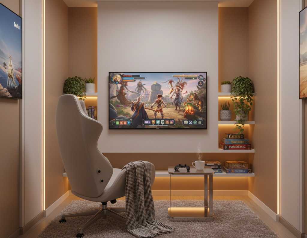
Neutral Tones for a Balanced Setup
Neutral tones form the backbone of a balanced setup, letting gear and lighting define the mood. This approach supports a clean, modern design while keeping the focus on performance and comfort.
Classic White
Classic white makes the room look bigger and brighter by reflecting light across the gaming setup. It provides a neutral backdrop so displays and peripherals stand out without visual clutter.
Choosing white paint gives the flexibility to update the room look with accents and peripherals over time. It keeps the overall atmosphere versatile and easy to adapt.
Matte Black
Matte black creates a focused, sophisticated atmosphere by minimizing distractions and glare. It helps players concentrate and makes illuminated gear pop against a deep, controlled backdrop.
Combining greys and other neutral shades can further reduce eye strain during long game sessions and maintain a professional, cohesive color scheme.
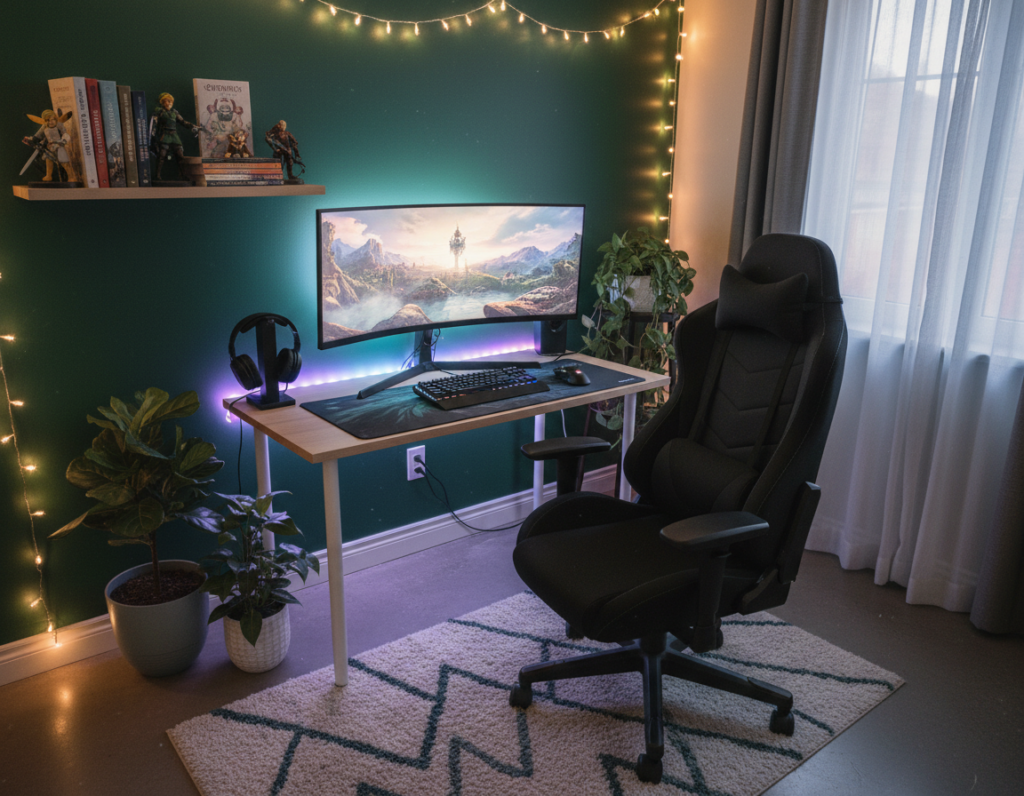
Cool Shades to Enhance Focus
Subtle cool tones create a steady backdrop that supports concentration and reduces fatigue. They help the player stay composed during extended sessions without drawing attention away from the setup.
The Calming Effect of Blue
Blue hues are proven to calm the mind and steady breathing, which helps with focus when a complex game demands deep attention. Choosing soft blues or slate tones for room paint can make room feel more serene and less distracting.
Mint green offers a fresher take. It can make room look more vibrant and help users feel energized during intense matches or long stretches of play.
- Cool blue tones improve comfort and allow for longer uninterrupted time on games.
- These shades reduce stress, making the space feel like a professional retreat.
- Right tones transform the gaming room into a peaceful sanctuary for mental clarity.
Warm Hues to Stimulate Energy
A palette of warm tones can spark enthusiasm and make time spent in the space feel more active. Designers and studies recommend blending warm and cool tones to support both comfort and focus.
Burnt Orange
Burnt orange brings a lively, earthy energy that helps players stay engaged. It works well as an accent to highlight shelving or a seating area.
This shade can make the room feel more enthusiastic, especially for those who prefer high-adrenaline sessions or creative work.
Sunflower Yellow
Sunflower yellow captures the warmth of sunny days and uplifts mood during long game stretches. It pairs well with neutral furnishings to avoid visual fatigue.
Used sparingly, this tone brightens a space without overwhelming the senses.
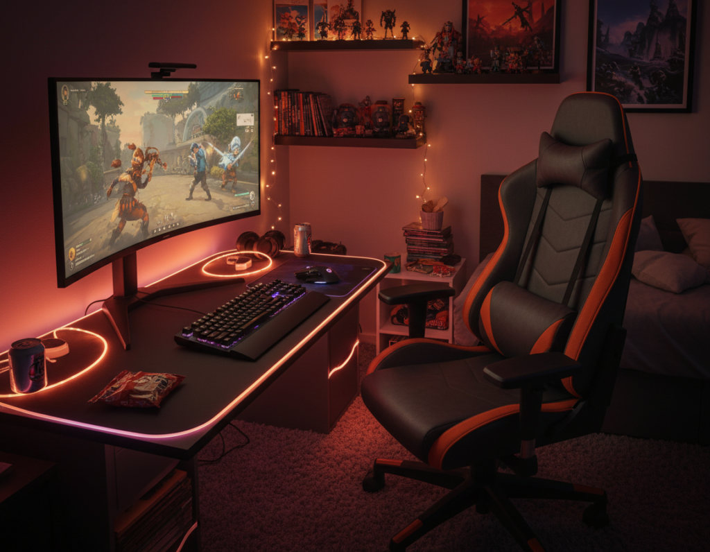
Fiery Red
Fiery red stimulates excitement and focus. Harvard’s Joint Center for Housing Studies (JCHS 2024) notes that warm tones like this can boost energy and competitive drive in a room.
“Combining warm and cool tones enhances comfort and concentration.”
As an accent, red creates a dynamic atmosphere that fuels passion for a game or design work. The right paint choice will make feel the room inviting and ready for action.
- Burnt orange energizes and supports high-adrenaline play.
- Sunflower yellow lifts mood for longer sessions.
- Fiery red is best used as an accent to spark excitement.
Unique Colors to Express Personality
Unique hues let players stamp their personality on a dedicated space. Pink offers a whimsical, upbeat touch that reflects individuality while they play their favorite games. Used as an accent, it brightens shelving, seating, or a focal wall without overpowering the layout.
Purple brings mystery and enchantment, ideal for fans of fantasy and story-driven game experiences. Deep aubergine or violet accents create an immersive backdrop that supports themed setups and dramatic lighting.
These choices let someone design a room that stands out and feels personal. Whether opting for bold or soft shades, the goal is to make the space inspiring every time they sit down to play.
- Expressive paint makes the area feel like a true sanctuary.
- Unique shades transform a standard room into an extraordinary space.
- Personal touches help link past gaming moments with future sessions.
Dynamic Color Combinations
Smart color pairings can turn a plain space into a confident, cohesive backdrop for any set-up.
Combining black and white creates a timeless scheme that adds modern sophistication to a gaming setup at home. This pairing keeps contrast high and lets light and gear stand out.
Blue and grey work as calming tones. These shades create a focused atmosphere that helps someone concentrate during a long game session.
Pairing green with black offers a striking, immersive effect. It can feel tech-forward and dramatic without overwhelming the senses.
- Red and black brings energy and mystery for a bold, dynamic space.
- Pink and white makes the area feel airy and playful while staying stylish.
- Purple and white gives a refined, imaginative look that keeps the setup elegant.
These balanced color schemes are practical ways to transform a room into a professional, visually stimulating hub. They help align light, tones, and paint choices with the player’s preferences.
Incorporating Texture and Industrial Elements
Raw textures and metal accents inject a bold, tactile layer into a modern gaming setup. Exposed brick, concrete panels, and brushed metal add depth and keep the space interesting to both see and touch.
Texture plays a key role in industrial design. It makes the environment feel rugged yet curated. Use targeted paint to highlight crevices in brick or to mute concrete without hiding its grain.
Adding metallic accents such as silver trim, copper shelving, or riveted details creates contrast. These accents bring a subtle glitz that elevates the overall design and frames gear so it stands out.
- Combine raw materials with refined metals for a cohesive look.
- Use paint strategically to emphasize texture and depth.
- Let industrial elements support the setup so equipment takes center stage.
The Role of Lighting and Accents
Lighting and accents shape how someone experiences a play session, turning a plain space into a deliberate stage. Proper light placement reduces glare and brings focus to the most important areas of the setup.
Neon Lighting Effects
Neon strips and RGB fixtures can transform a gaming space into a vibrant arena. Used as accent lighting, they frame desks and shelving so gear and displays pop.
Neon also helps navigation during late-night sessions and introduces mood without heavy fixtures. Combining warm and cool tones lets someone tune energy levels to match the game.
Using Wall Murals
Murals featuring characters or abstract motifs add a personal touch that anchors a room look. A well-placed mural becomes a focal point and supports themed scenes for favorite games.
Pair murals with directed light to avoid glare and highlight texture. This approach makes room look immersive while staying practical for long sessions.
- Accent light guides attention and reduces eye strain.
- Neon plus murals creates a dynamic, cohesive room look.
- Smart lighting choices improve both function and overall experience.
Professional Tips for Testing Paint
A quick test patch can reveal surprises in how tones shift under different light sources. Professionals recommend trying samples on the actual surface in the home before committing to a full paint job.
Test at different times of day. Observe the sample in morning sun, midday light, and under artificial lamps. This shows how the paint reacts to warm and cool light and how the tones interact with furnishings.
Samantha Lee, Senior Designer at the US Green Building Council, advises satin or semi-gloss finishes for more uniform reflection of ambient light.
“Satin or semi-gloss finishes reflect ambient lighting more uniformly.”
Order peel-and-stick samples from services like Samplize to move quickly from idea to reality. Nippon Paint also has a paint calculator and access to professional experts to simplify the process.
- Test paint samples on the actual wall and observe across days.
- Try satin or semi-gloss to manage glare and enhance tones.
- Use peel-and-stick swatches and online calculators to refine your choice.
Conclusion
A smart paint choice can lift any game setup from ordinary to memorable in minutes.
Choosing the right gaming room paint helps focus, eases strain, and boosts comfort during long sessions. Exploring paint ideas and paint colors lets someone match mood with function.
Applying home design principles ensures balance between looks and use. Thoughtful color schemes can transform gaming and reshape how a space feels.
Use small tests and daylight checks before committing. With careful choices, the result is an immersive, personal experience that reflects style and supports play.